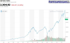

Like you, we have heard about amazing stock market crashes every other day since the coronavirus COVID-19 outbreak hit Europe, Canada and the United States. However, today we heard that the S&P had dropped all the way back to 2012 numbers and that got us thinking about how bad this financial crisis actually is.
The charts below show that if you put money into the markets in recent year, it has taken a big hit BUT:
There is definitely ‘blood in water’ as financial advisors like to say and the recent flailings of the markets has been of historic proportions. Many people will loose their jobs; many people will loose their homes and some industries will be forever changed, but long term investors are going to be ok.
Click on these graphics to see the real numbers from the US S&P, US NASDAQ, Canadian TSX, Japanese Nikkei and Germany DAX to decide for yourself.
The charts on the left show the last 40 years and the charts on the right show the last 1 year
Click to expand these graphics
This website uses cookies.